
The evolution of the Olympic Games logo

We review the history of the Olympic Games through the design of their logos, where we see a clear evolution of style over time.
Little did the French pedagogue and historian Pierre de Coubertin imagine that the idea he had in 1896 to revive the Olympic Games held by the Greeks in ancient times would become the sporting event it is today, followed by more than 5 billion people around the world. In this special, we are going to focus on the evolution of the Olympic Games logo throughout history.
The logo that represents the Olympic Games as we know it today dates back to 1924 Previously, we only found advertising posters announcing the celebration of the most important event worldwide.
The first designs
Before 1924, there were only very colorful advertising posters inspired by the modernist aesthetic of the late 19th century and the Art Deco of the first decades of the 20th century. But the first Olympic Games to have a logo were those of Paris in 1924, which featured a galley with unfurled sails, a very characteristic of the coat of arms of the French city.

In the event of 1928 Amsterdam, the first sponsor of the Olympic Games was Coca-Cola. And Gebrüder Dassler Schuhfabrik, now better known as Adidas, introduced its first products. In addition, the Olympic flame was lit for the first time.
The symbol of the rings appears for the first time in the graphic image of the Los Angeles 1932 Olympics, which is completely integrated into the composition. And it is used, as a novelty, the color in the logotype. The person in charge of creating the logo for Berlin 1936 was Johannes Boehland. He proposed the design of the emblem with the five Olympic rings< /strong> and the image of the eagle superimposed on the Brandenburg Gate. However, the Chairman of the Organizing Committee ordered to open the lower part of the design, which turned out to resemble a bell.




After 12 years without the Olympics, due to the outbreak of World War II, the Olympics were held again in London, in 1948. The corporate image was composed of a black and white illustration of the famous “Big Ben.” Including characteristic elements of the host countries is a resource widely used throughout the history of logo design. Helsinki 1952 would also use its Olympic tower as an image and a monochrome design in blue. In the logo of Melbourne 1956, the Olympic rings are again found integrated into a design which once again relies on a single colour, green.

The history of Rome is the protagonist of the logo of the 1960 Olympics. An embossed emblem was introduced with the image of the she-wolf that suckled Romulus and Remus. The Tokyo 1964 games were the first in Asia. And since then, the design took shape because a specific code was created of pictograms. Later identities would be more complex and ambitious to meet the needs of Advertising and Marketing. With the arrival of Mexico 1968 and the first Olympic Games in Latin America, the Pop-art aesthetics make their appearance in the visual identity.
The modern era

The Munich 1972 logo is considered by many experts to be the best logo for the Olympics. It was created by German designer Otl Aicher, founder of the Ulm school. He even designed the first mascot for the Olympics, the dog Waldi. The author wanted to recreate the flashes of light caused by the lighting of the Olympic flame, as well as evoking other subjective concepts such as freshness, generosity or the spirit of the games.
At Montreal 1976 the rings appear integrated into an abstract symbol that is identified with the winners’ podium and the initial M of the city’s name. Moscow 1980 presented a very communist logo. Parallel lines reminiscent of the Kremlin flag, a five-pointed red star and the Olympic rings integrated into the composition. All in red, of course.

However, the graphic composition created by Deborah Sussman for Los Angeles 1984 was the opposite of the previous Olympics. It projected the dynamism and freedom that capitalism boasted.
The logo for the Seoul 1988 Olympics was inspired by “samtaeguk”, a craft used in home decoration. Spaniards also got an A+ for creativity. The logo designed by Josep Maria Trías for the Barcelona 1992 Olympic Games focused for the first time on the figure of the athlete instead of giving prominence to the host country. A freehand symbol as a tribute to local artists such as Miró, Dalí or Gaudí. In three strokes, the action of an athlete when making the jump was captured. The blue square identifies the Mediterranean, the yellow curve acts as arms and the red line draws the legs while transmitting dynamism.

Atlanta 1996 had a great responsibility because the centenary of the Olympic Games was being celebrated. That’s why it introduced the number 100 in the logo. Sydney 2000, due to its similarity and the prominence of the athlete, could be a plagiarism of Barcelona 1992. The Athlete of the Millennium, as its logo became known, uses three boomerangs to form a human silhouette. A “kotinos” or laurel wreath is the logotype that stars in the Athens 2004 logo, in honor of the winners of the ancient Games.

Chosen from 1,985 proposals received from around the world, the emblem known as “Dancing Beijing” of Beijing 2008 was designed by Guo Chunning and the The shape of the character is reminiscent of the Chinese ideogram 京 (jing), meaning “capital”. Controversy has sometimes accompanied different proposals from the moment they were presented. This is the case of the London 2012 logo. Many consider it a construction based on swastikas, but for others, a totally innovative concept with which the author knew how to transmit the values of sportsmanship. The Rio 2016 logo was widely accepted after its presentation. The concept of two joined hands developed by the Brazilian agency Tátil, symbolizes companionship, passion and modernity.

The controversy comes with the logo of Tokyo 2020

The logo of the Tokyo Olympics 2020 has been a year of controversy. A plagiarism lawsuit filed by Belgian designer Olivier Debie led to the logo initially created being scrapped. A new call for applications was opened to graphic designers of all nationalities and with all kinds of experience to create a new one. The requirements: being over 18 years old and residing in Japan. The result: 14,599 graphic logo designs, from which four were shortlisted. The winner: Japanese designer Asao Tokorowith a design that shows an interrelationship based on the movement of its three rectangular shapes, through which its author wanted to capture the diversity that characterizes an event of such dimensions.

The logo of the Paris 2024 Olympic Games
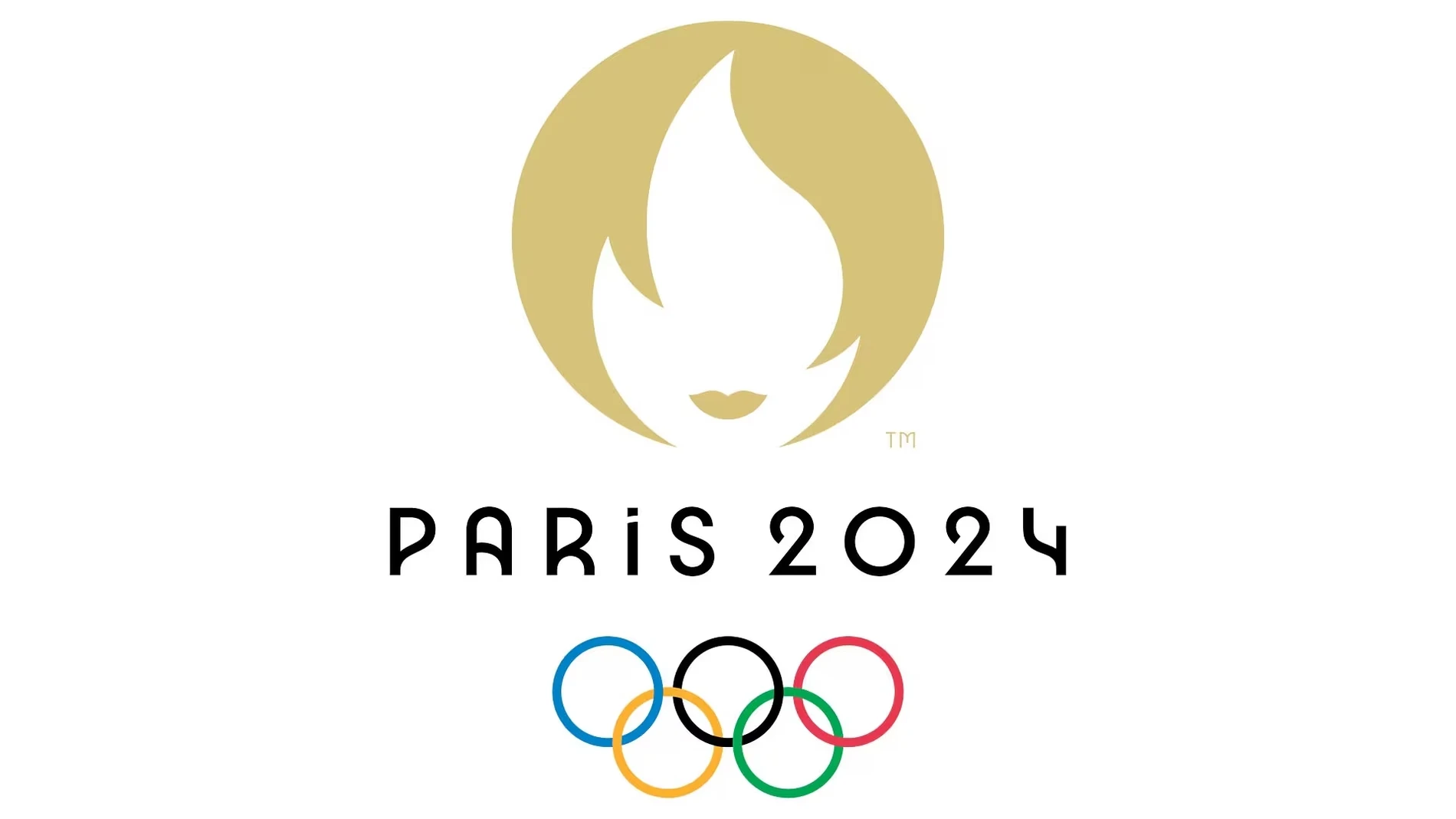
For the Paris 2024 Olympic Games, a logo has been created that combines the gold medal, the Olympic torch and the image of Marianne, a symbol of the French Republic. The logo has been created by Royalties Ecobranding and pays tribute to female athletes and inclusion in the games.
The typography pays tribute to Art Deco and is inspired by the Paris metro. It has seven variants and a dark mode for digital devices. A design that reflects a movement towards more inclusive gaming.